Color theory is a critical component of filmmaking that influences the emotional and psychological responses of viewers. By understanding how colors interact and what they represent, filmmakers can craft narratives that resonate deeply with audiences. This article delves into the fundamentals of color theory in filmmaking, exploring its significance, various color schemes, and how to effectively implement these concepts in your projects.
The Basics of Color Theory
Color theory encompasses three primary components:
Hue: The actual color itself, such as red, blue, or yellow.
Saturation: The intensity or purity of a color. A highly saturated color appears vibrant, while a desaturated color looks more muted.
Brightness: The lightness or darkness of a color, which can affect the mood of a scene.
Understanding these elements allows filmmakers to manipulate color to evoke specific emotions and set the tone for their narratives.
The Role of Color in Storytelling
Color plays a vital role in storytelling by:
Eliciting Emotional Responses: Different colors can trigger various feelings. For example, red often symbolizes passion or danger, while blue evokes calmness and tranquility. Filmmakers use these associations to enhance the emotional depth of their stories.
Defining Characters: Colors can help characterize individuals. A character dressed in bright, warm colors may convey energy and optimism, while darker, muted tones might suggest seriousness or melancholy.
Setting the Scene: Colors can indicate the time and place of a scene. Warm colors might suggest a sunny day, while cooler tones can evoke nighttime or a somber atmosphere.
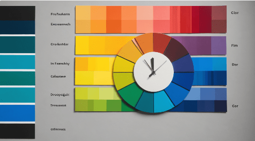
Common Color Schemes in Film
Filmmakers often utilize specific color schemes to create visual harmony and enhance storytelling. Here are some popular schemes:
1. Monochromatic Color Scheme
This scheme uses variations of a single hue, including different shades and tints. Monochromatic palettes create a unified look and can evoke a specific mood, whether somber or vibrant. For instance, a film may use varying shades of blue to convey a sense of melancholy.
2. Complementary Color Scheme
Complementary colors are located opposite each other on the color wheel (e.g., red and green, blue and orange). This scheme creates visual tension and drama, making it effective for highlighting key elements in a scene. The contrast can draw attention to characters or important plot points.
3. Analogous Color Scheme
Analogous colors are adjacent on the color wheel and create a sense of harmony. This scheme is often used to maintain a cohesive look throughout a scene or film. For example, a combination of blue, green, and teal can create a serene underwater atmosphere.
4. Triadic Color Scheme
This scheme involves three colors that are evenly spaced around the color wheel. Triadic palettes offer a balanced yet vibrant look, making them suitable for lively scenes. An example would be using red, yellow, and blue to create a playful and energetic vibe.
5. Tetradic Color Scheme
Tetradic schemes consist of four colors that form two complementary pairs. This approach can be challenging but allows for rich and diverse visuals. It’s effective for creating complex scenes with multiple focal points.
The Psychology of Color
Understanding the psychological effects of color can greatly enhance a filmmaker’s storytelling capabilities. For instance:
Red: Often associated with passion, love, or danger, red can heighten tension or excitement in a scene.
Blue: This color typically conveys calmness, sadness, or introspection, making it ideal for reflective moments.
Yellow: Associated with happiness and energy, yellow can inject positivity into a scene but can also become overwhelming if overused.
By strategically employing these colors, filmmakers can subtly guide audience emotions and reactions throughout the film.
Implementing Color Theory in Your Films
To effectively use color theory in your filmmaking:
Create a Mood Board: Develop a visual reference that captures the desired color palette and mood for your project. This can help guide your choices during filming and post-production.
Experiment with Color Grading: In post-production, utilize color grading techniques to enhance or alter the colors in your footage. This can help achieve the intended emotional impact and visual style.
Be Consistent: Maintain a consistent color scheme throughout your film to reinforce themes and character arcs. Recurrent colors can symbolize character development or emotional transitions.
Conclusion
Color theory is an invaluable tool in filmmaking that can profoundly influence storytelling and audience engagement. By understanding the basics of color, exploring various color schemes, and recognizing the psychological effects of colors, filmmakers can craft visually compelling narratives that resonate with viewers. As you develop your projects, consider how color can enhance your storytelling and create a more immersive experience for your audience.
